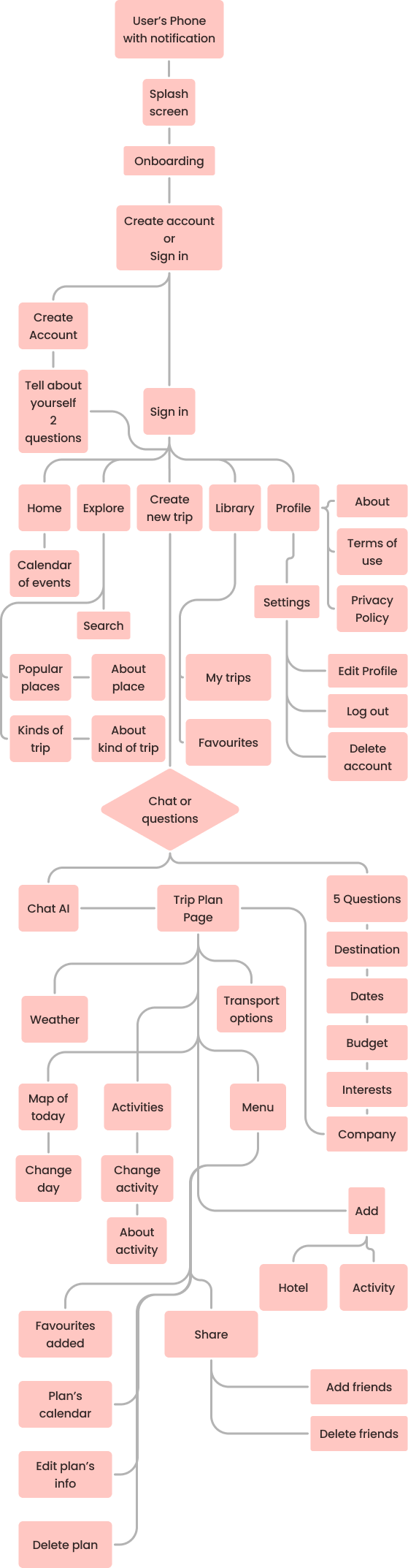


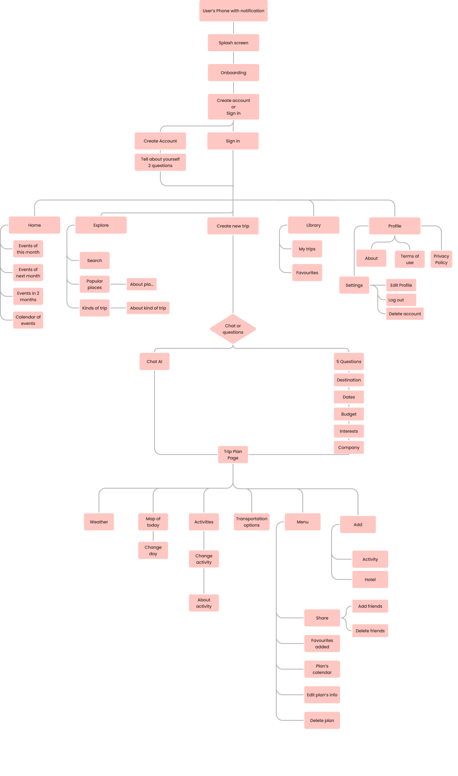
Information architecture
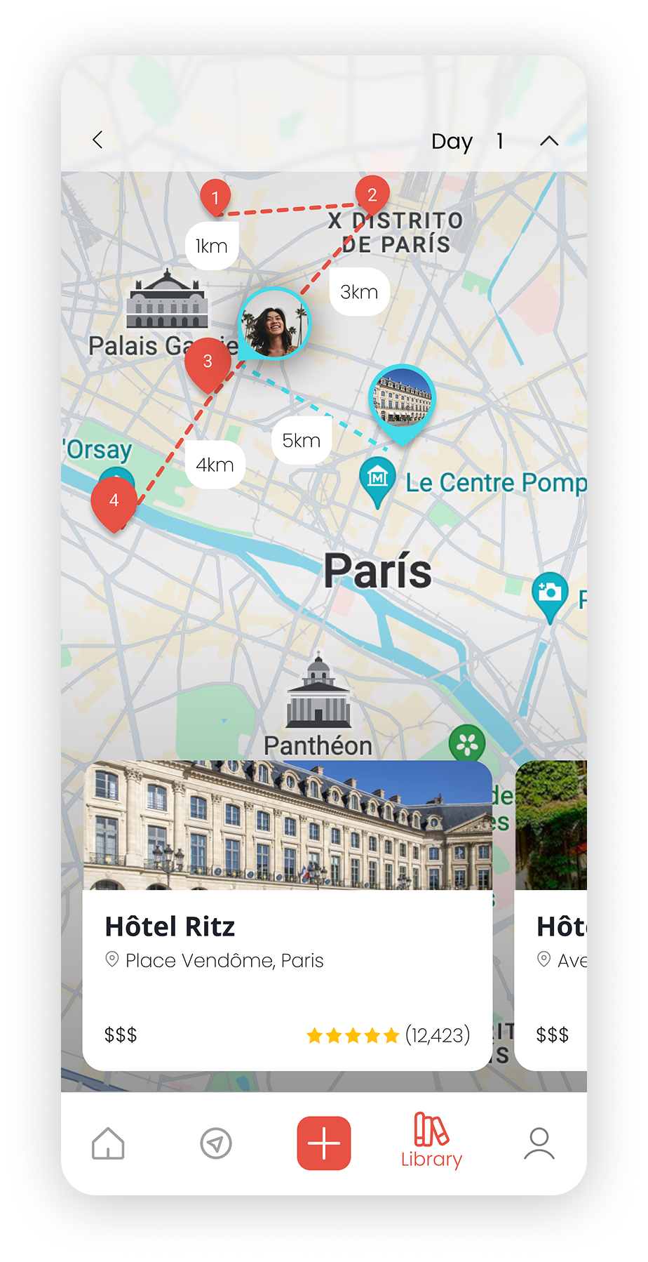
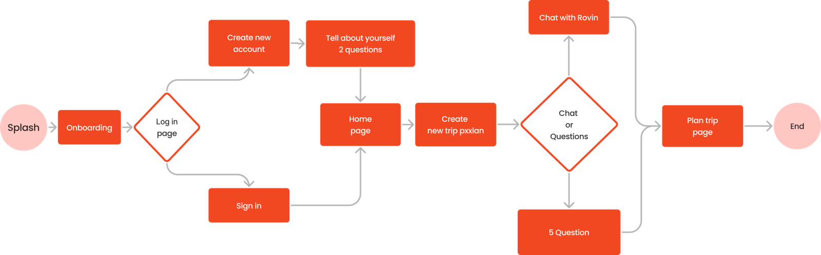
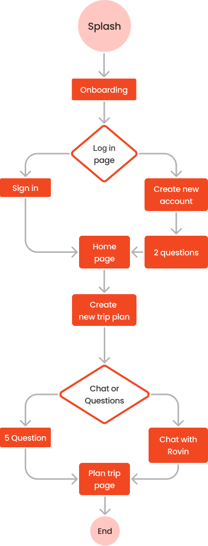
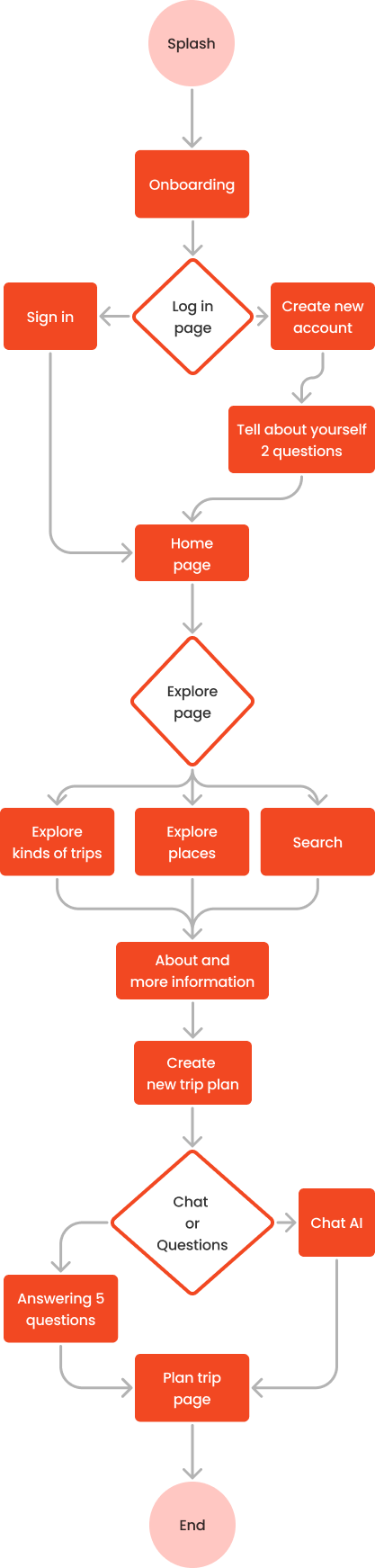
Key user flow
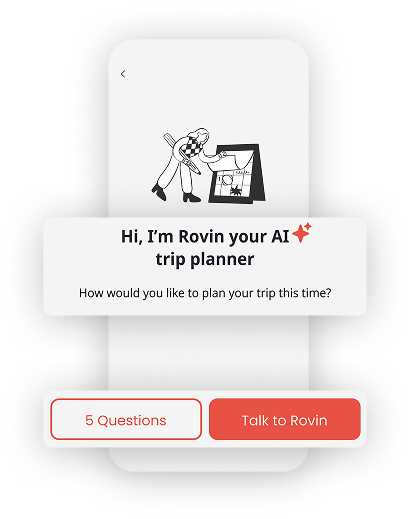
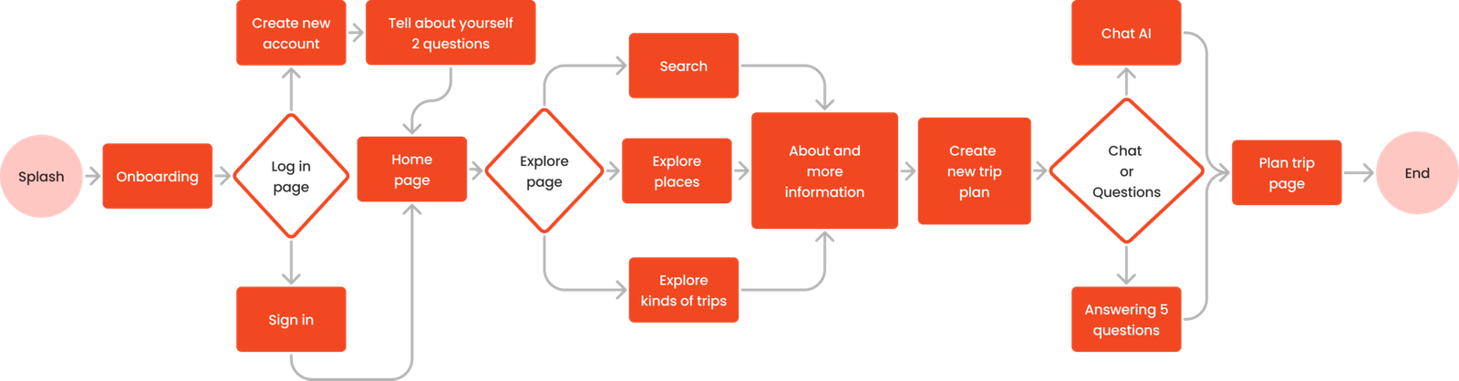
Secondary flow
Information architecture