A complete redesign for a Bach flower therapy store, focused on creating a calm, natural experience that connects users to the products.
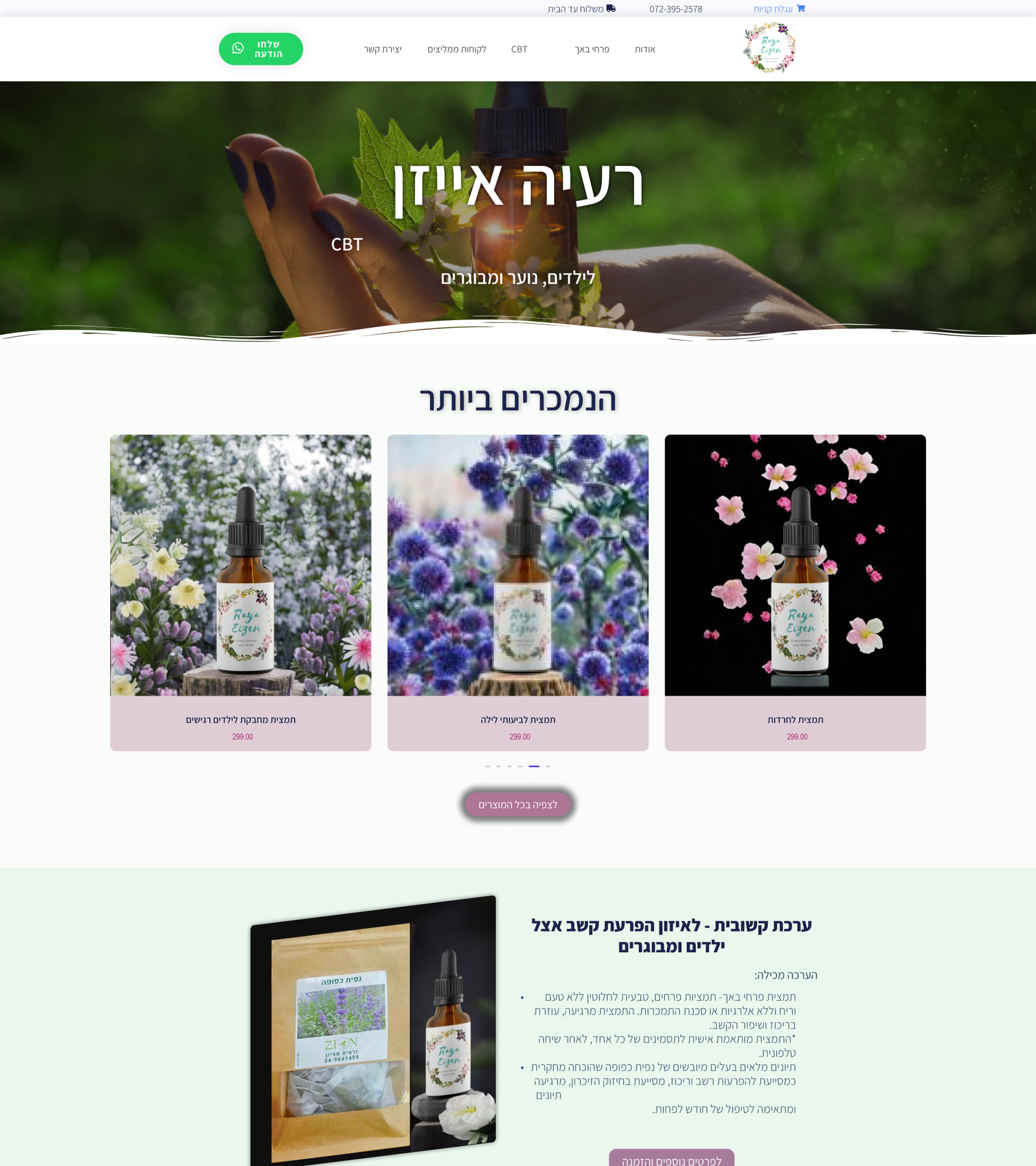
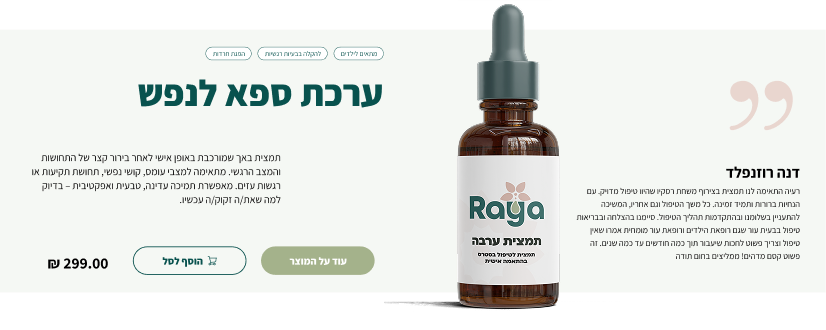
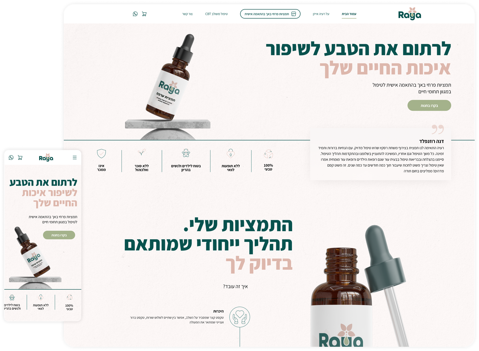
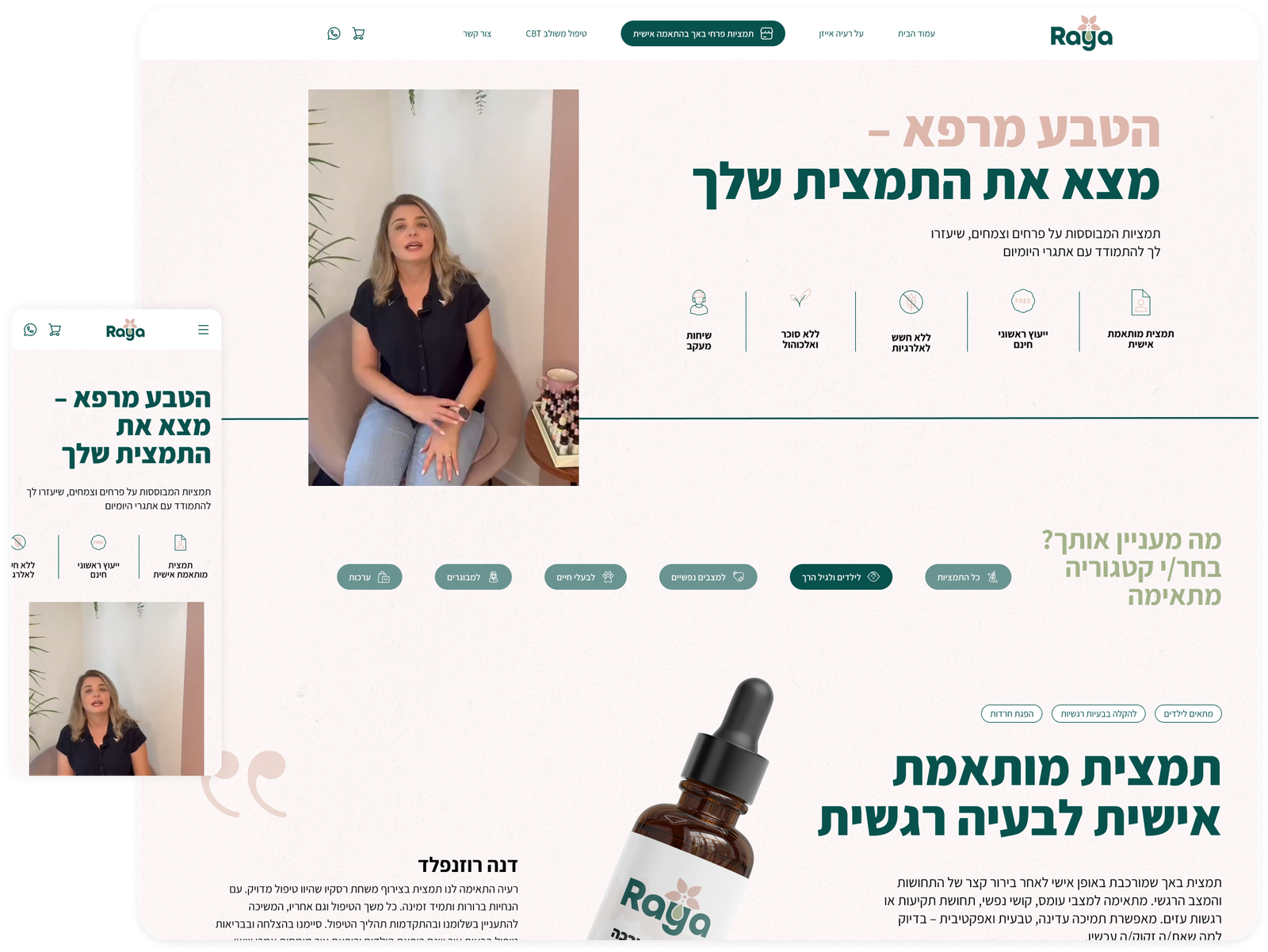
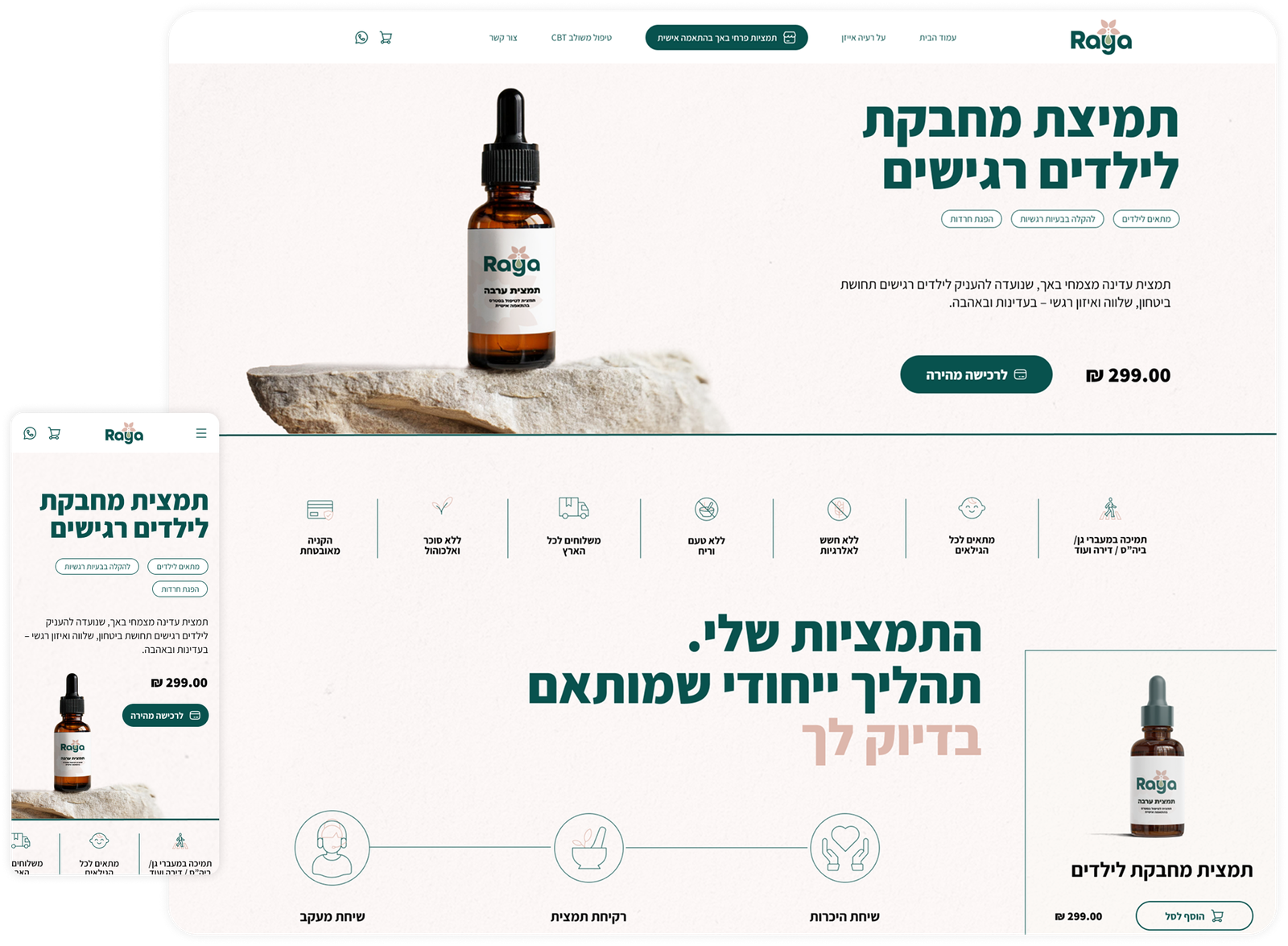
The previous website didn’t reflect the depth and sensitivity of Raya’s work. The design felt outdated and slightly clinical, which created distance instead of trust. For a brand centered around emotional care, that gap was significant.
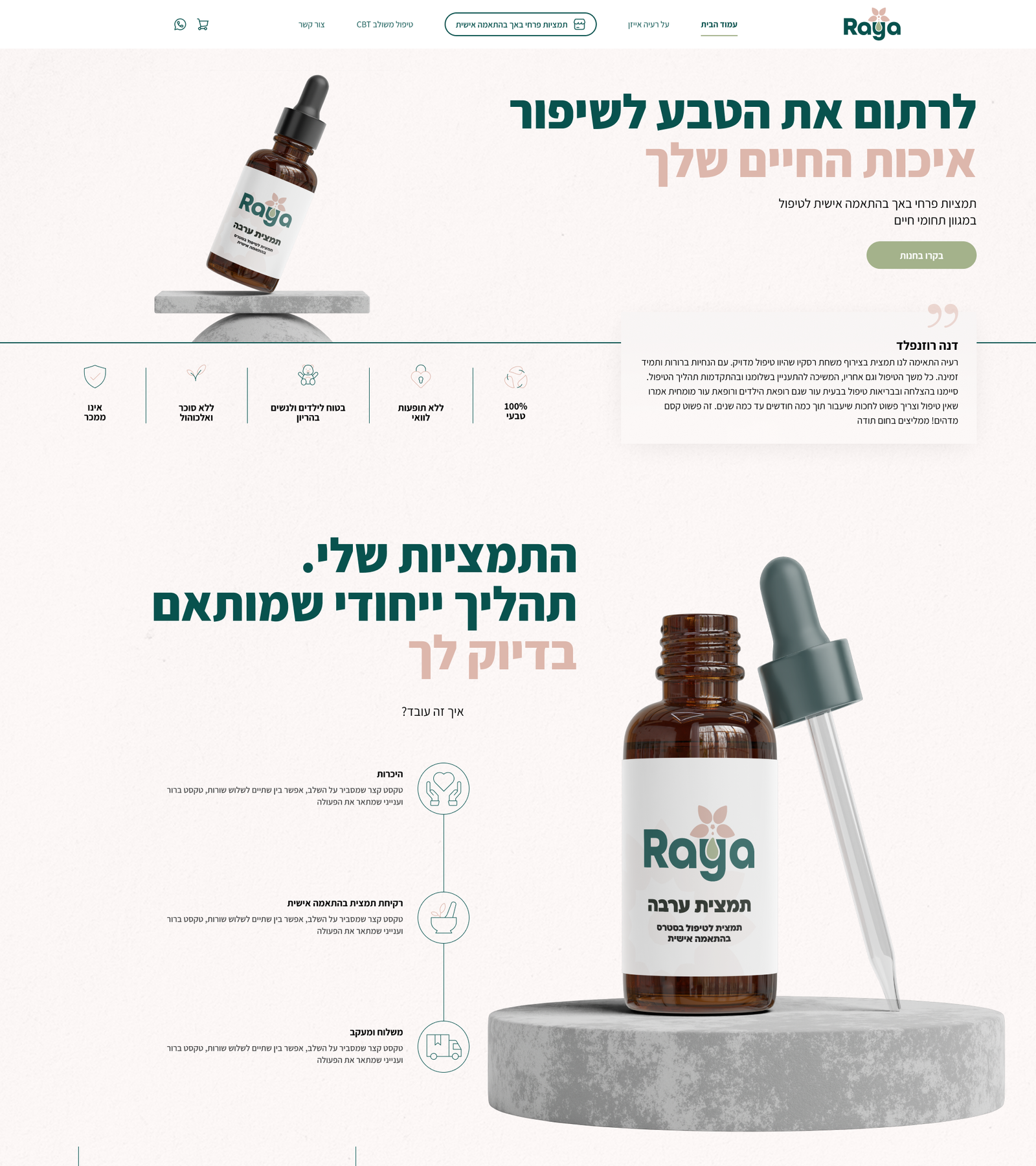
The task was to rebuild the experience from the ground up. The new website needed to feel professional yet warm, structured yet human, and clearly communicate the connection between CBT and Bach flower therapy in a way that feels natural and easy to understand.
Reduce visual clutter and organize the content so users can quickly understand what each product does and feel confident in their decision.
Ensure that the natural and therapeutic foundations of the brand are visible throughout the entire experience, from layout to micro-interactions.
Design a journey that feels steady and supportive, especially for users who may already be navigating emotional challenges.
Shift the experience from a standard e-commerce interaction to something closer to a guided, thoughtful consultation.
The previous website lacked a clear visual hierarchy and did not fully communicate the brand’s values or support a confident shopping experience.
Before
After
Before
After
This project focused on users seeking more than a product. They are often looking for reassurance and support.
The primary audiences include:
Individuals searching for natural, gentle solutions to improve their well-being
Parents looking for emotional support tools for their children
Teenagers and adults interested in a combined approach of CBT and Bach flower remedies
The goal was to move away from a design mess and create one visual language that feels organic, balanced and grounded. The visual direction was shaped around values of trust, sensitivity, and natural healing.
A clear and balanced layout that reflects expertise while remaining approachable
A nature color palette that feels calm and reassuring
Professional and refined, without feeling distant or overly commercial
New logo symbol combines a soft floral form with a subtle drop element, representing both the natural origin of Bach remedies and the emotional depth of the therapeutic process.
Assistant brings softness to the interface. Its rounded shapes and natural rhythm make the reading experience feel calm and approachable.
rgb(8, 82, 78)
#08524E
rgb(221, 183, 172)
#DDB7AC
rgb(164, 178, 139)
#A4B28B
rgb(255,255,255)
#FFFFFF
rgb(0,0,0)
#000000
Small introduction card. Appears in home page, has product name, short description and read more button.
Full product card, with description, tags, price, preview image, recommendation, and buttons – add to cart and read more.
A calm, intuitive shopping experience that connects therapy and nature.
Clear emotional entry point
Soft hierarchy and guided navigation
Immediate explanation of CBT and Bach connection
Simplified product grouping
Filtered by emotional needs
Calm and breathable layout
Clear explanation of benefits
Gentle tone
Guidance instead of pressure
* Designed for Studio Deshe
Designing Raya required a sensitive balance between commerce and care. The project strengthened my ability to translate emotional and therapeutic values into a clear, trustworthy shopping experience while supporting business goals.