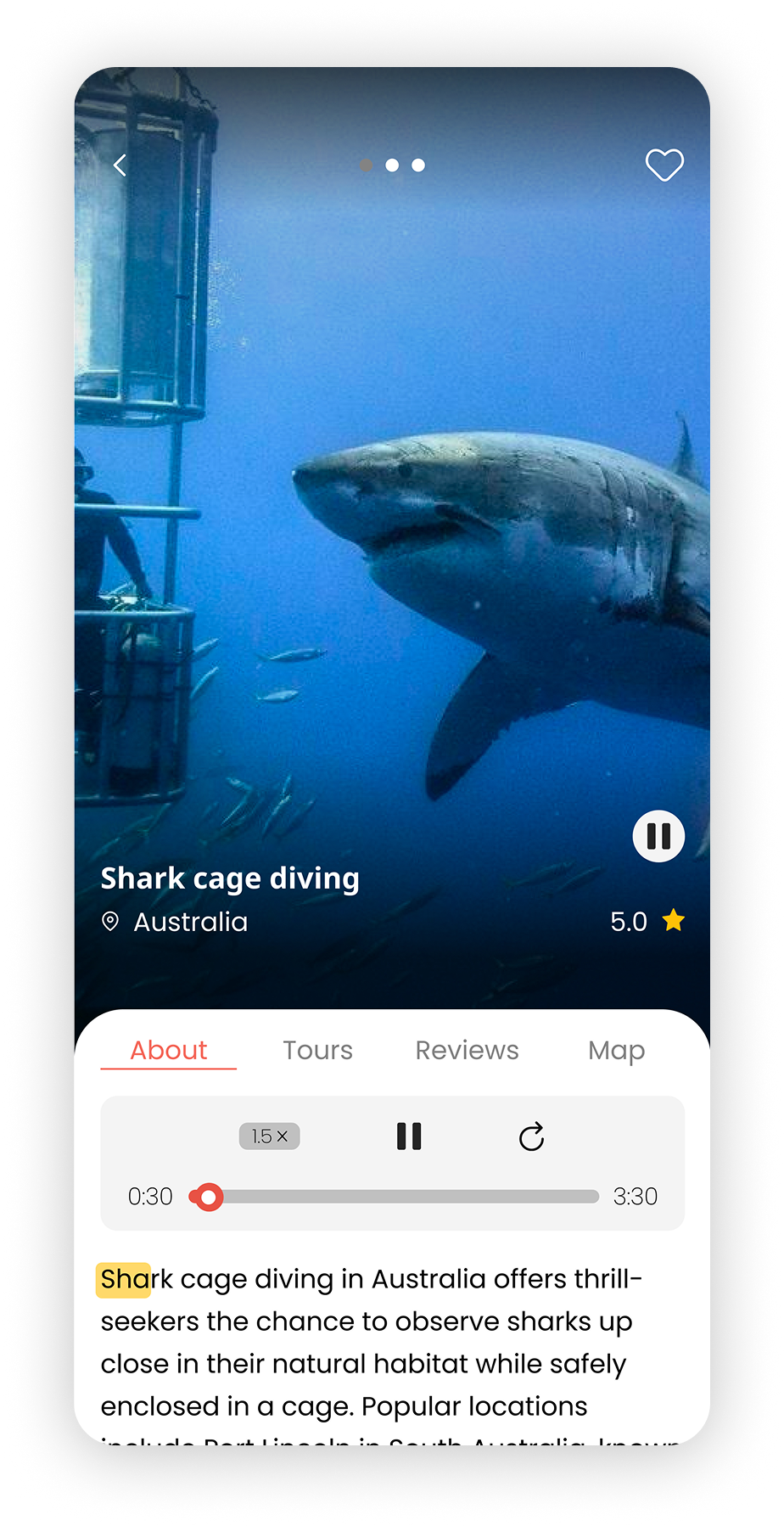
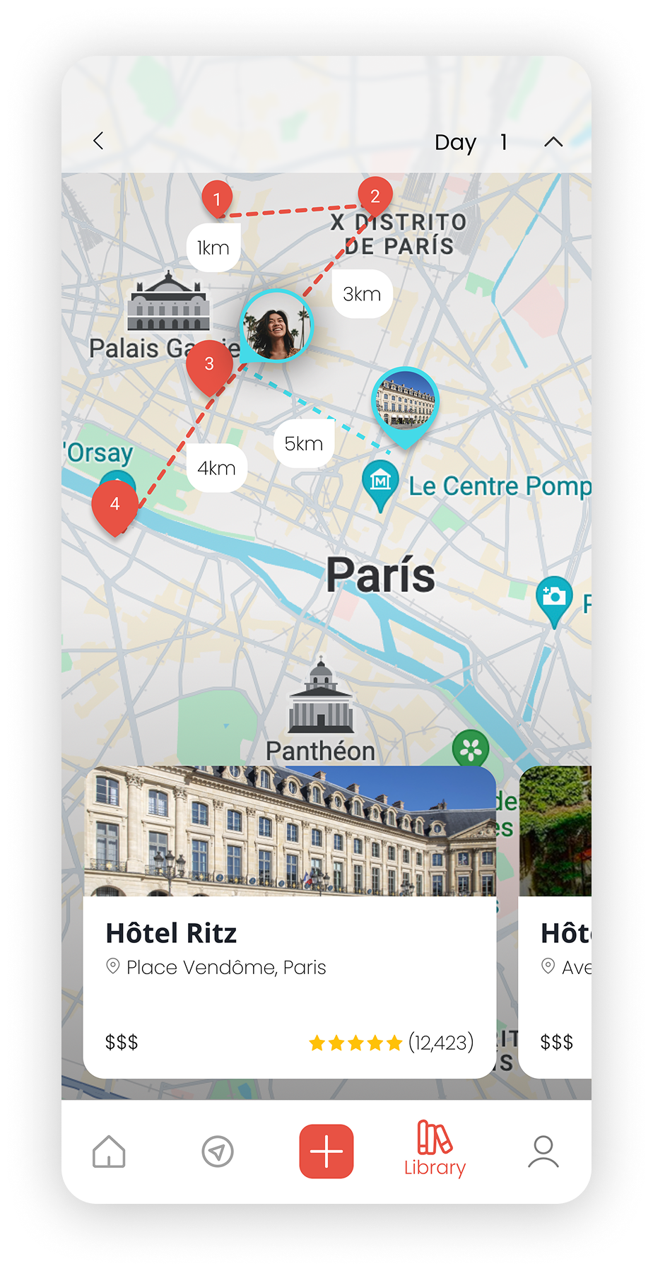
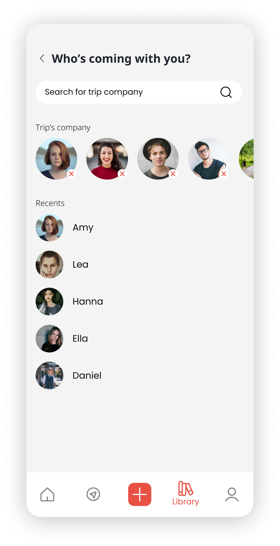
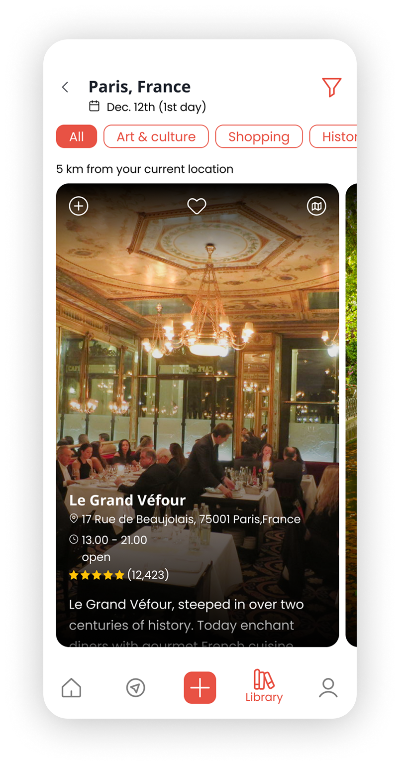
Users juggle 2-3 apps, drown in options, and still end up confused. Routes, attractions, accommodation, timing, all scattered across different tools. The goal was simple: bring everything into one place that actually thinks for the traveler.
After designing the initial solution, we tested with real users to evaluate clarity, flow, and overall usability. Three key areas surfaced that needed iteration.
Before
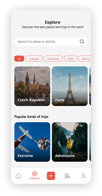
Users felt overwhelmed when starting a new trip and weren’t sure where to begin.
After
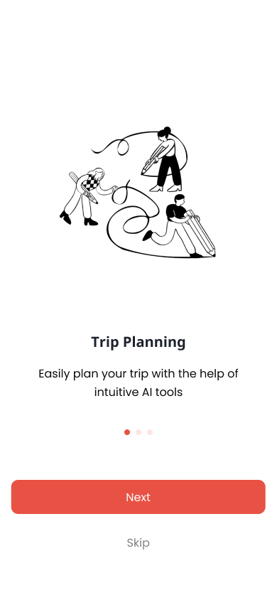
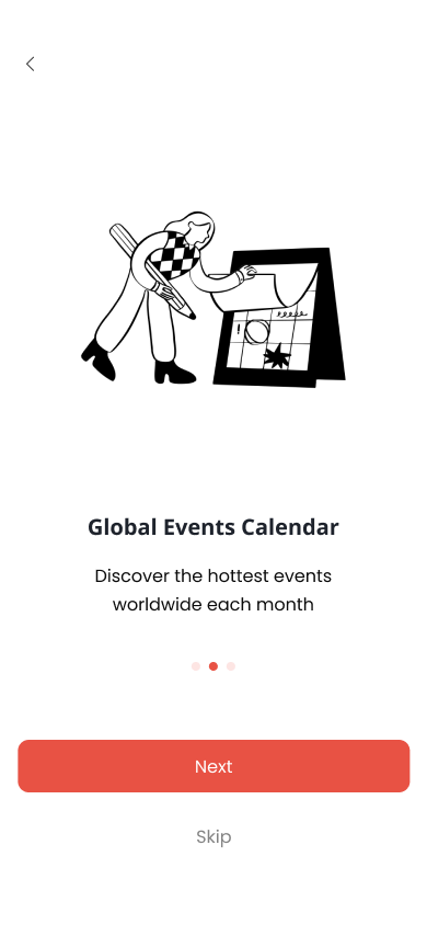
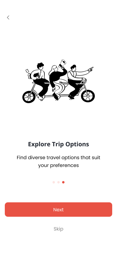
We introduced a guided onboarding flow that asked about interests and priorities first.
Before
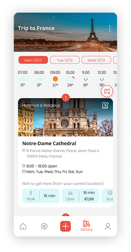
Important info (dates, reservations) was easy to miss during planning.
After
Clear visual hierarchy and reminders for critical moments in the trip.
Before
Interface felt heavy as more features were added during development.
After
Simplified layouts, unified components into a single design system.
Before
Users felt overwhelmed when starting a new trip and weren’t sure where to begin.
After
We introduced a guided onboarding flow that asked about interests and priorities first.
Before
Important info (dates, reservations) was easy to miss during planning.
After
Clear visual hierarchy and reminders for critical moments in the trip.
Before
Interface felt heavy as more features were added during development.
After
Simplified layouts, unified components into a single design system.
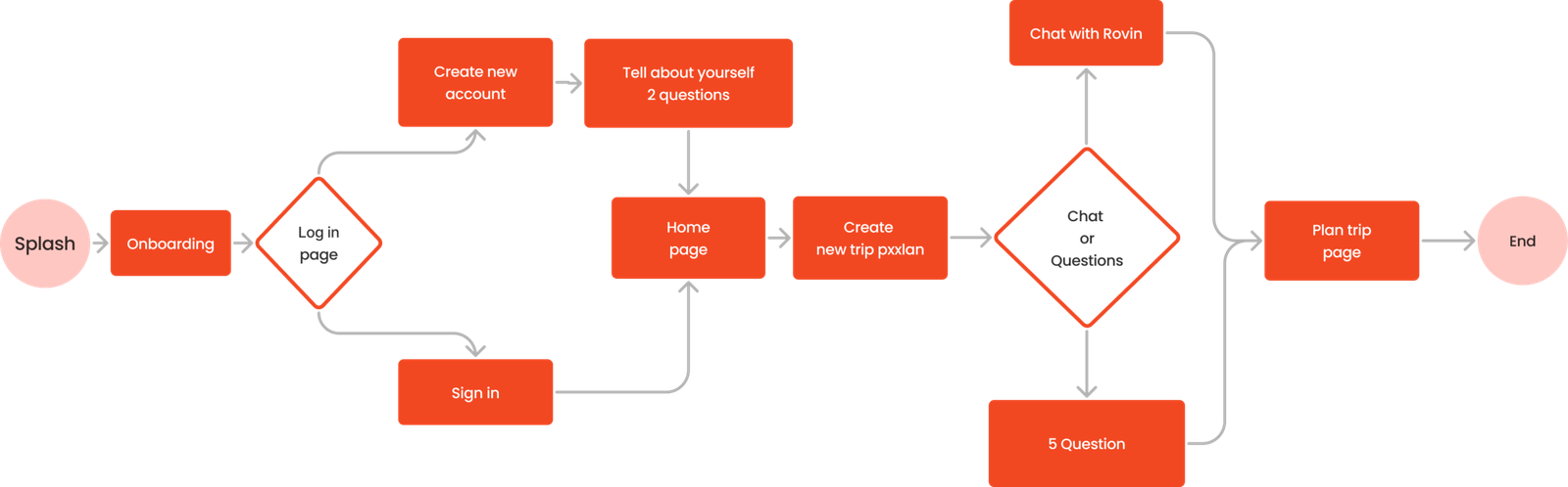
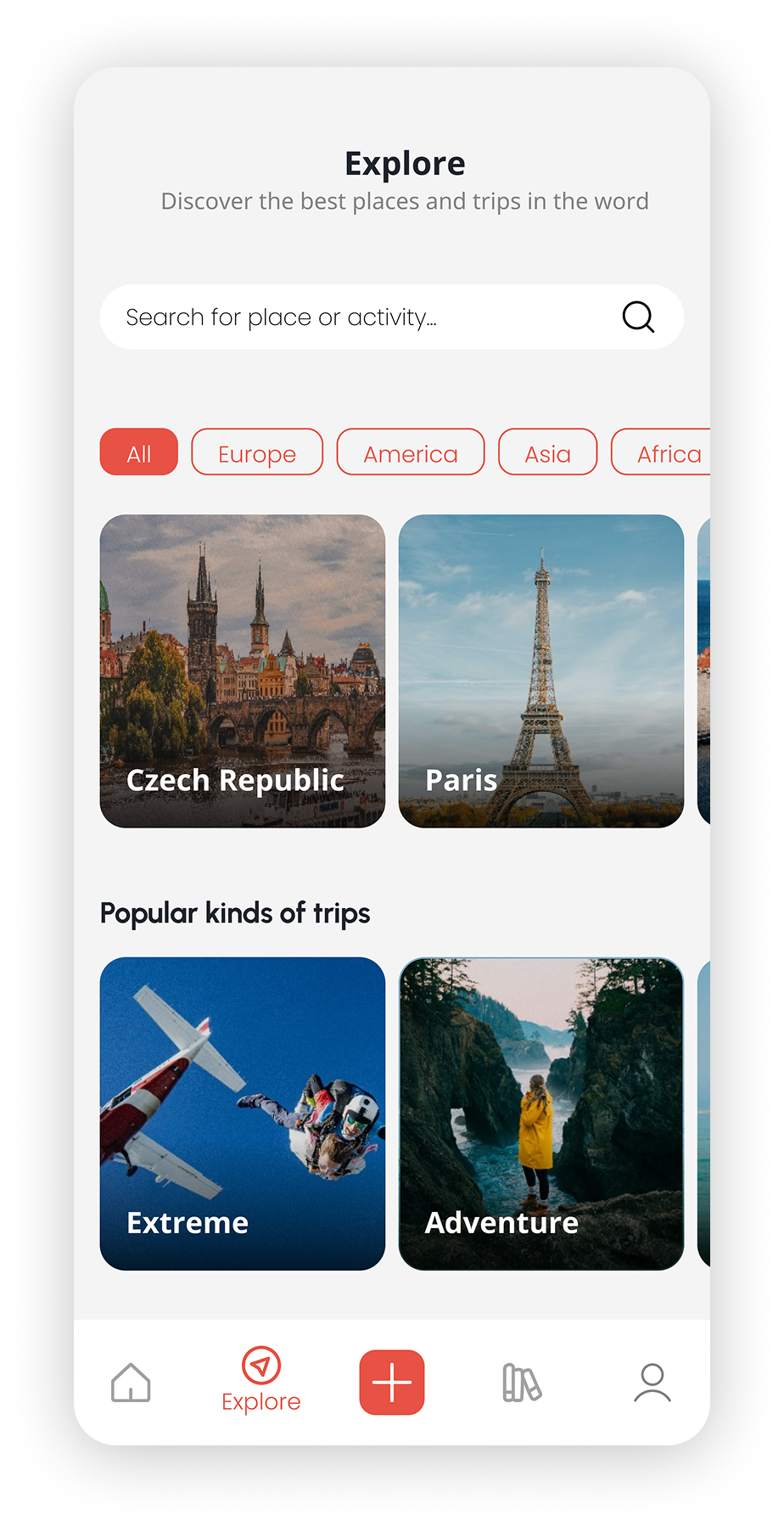
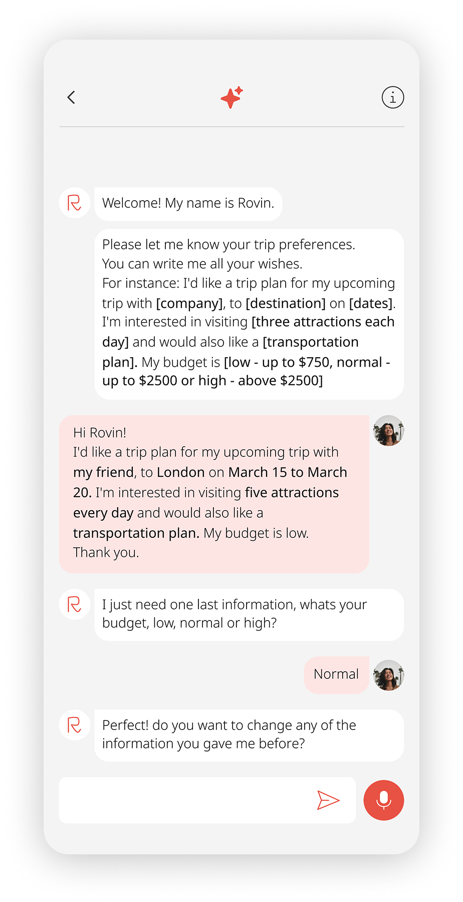
The primary user journey – from splash screen to a fully planned trip.
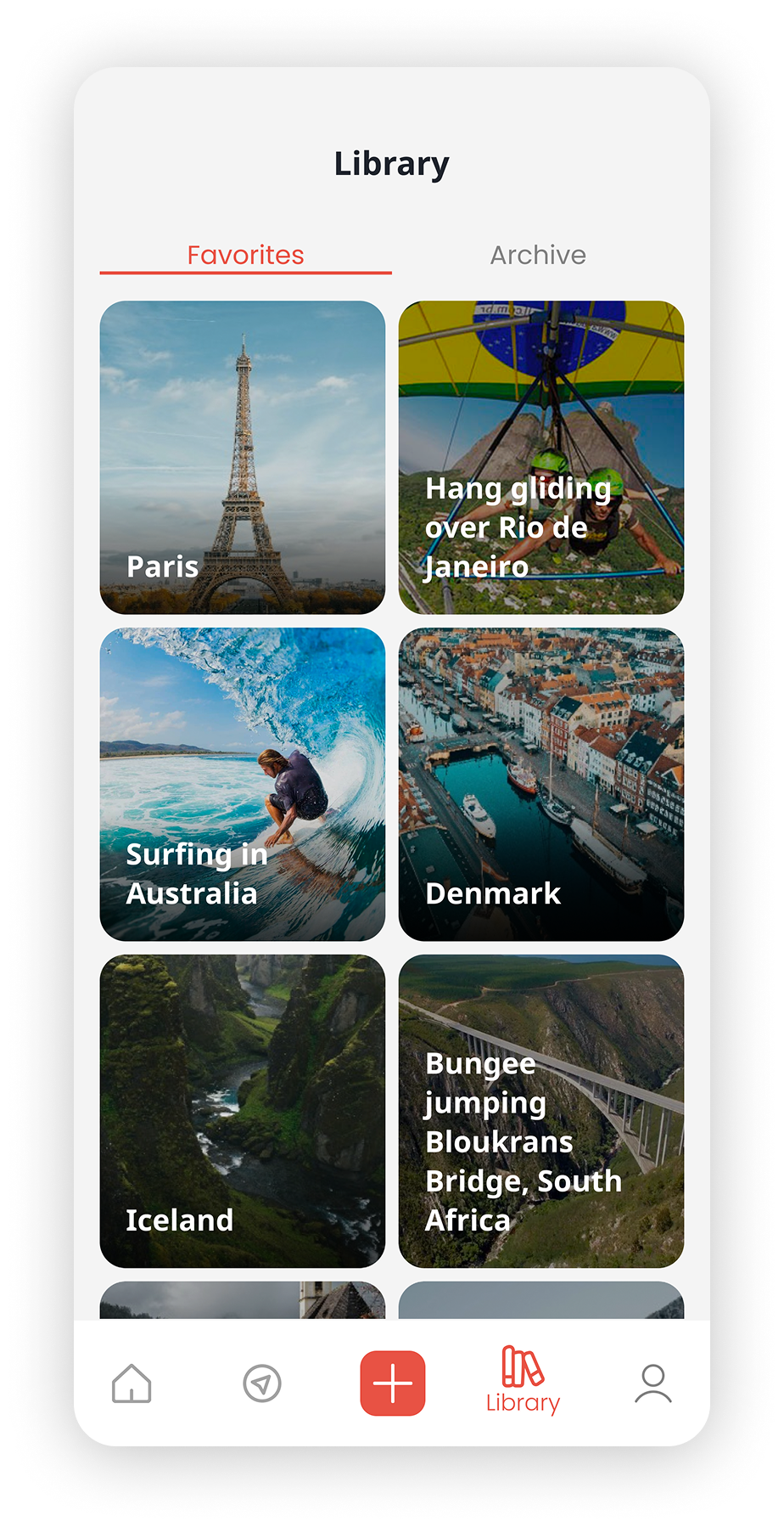
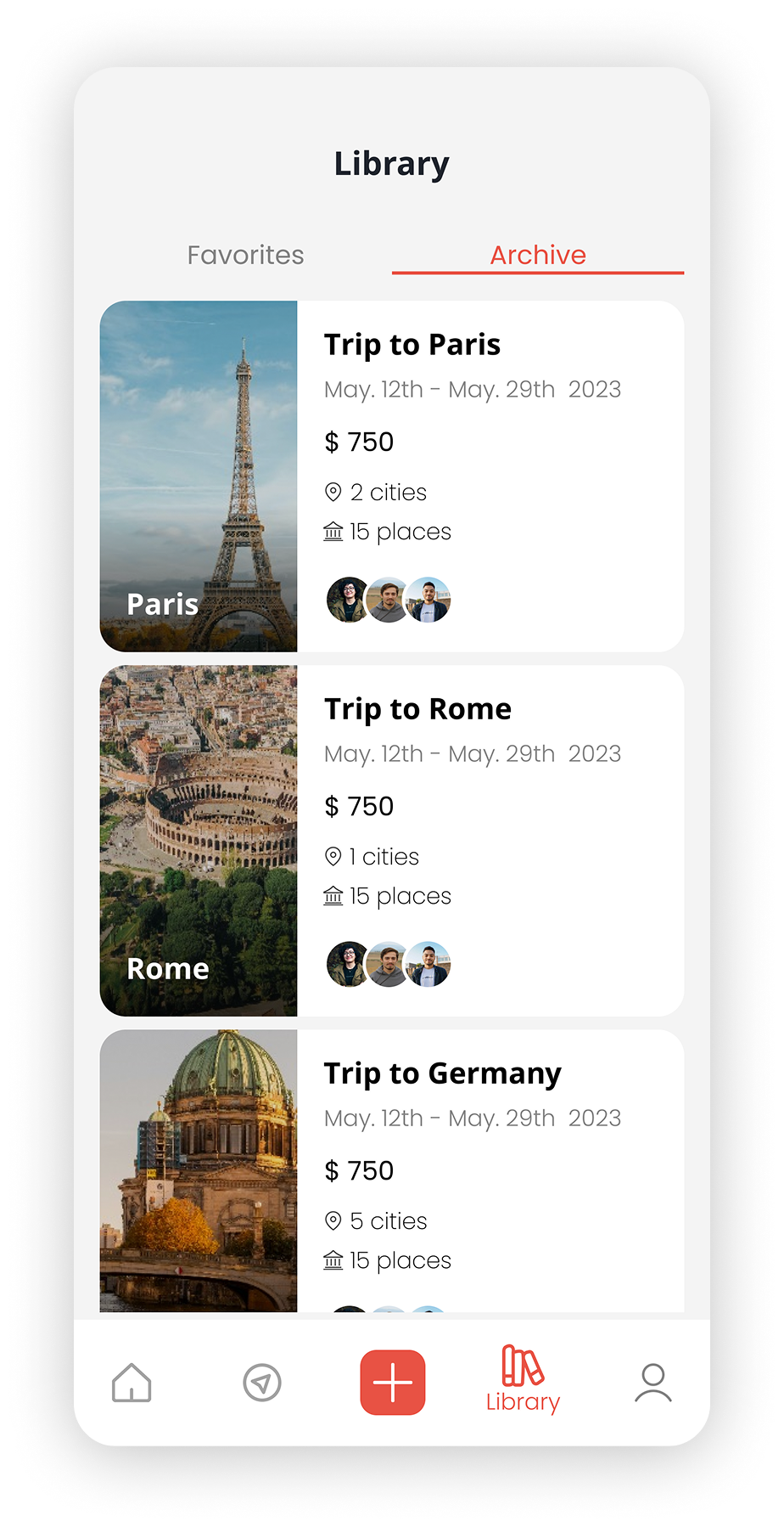
Rove was designed as a single, cohesive travel planning experience bringing planning, discovery, and organization into one flow.
Instead of switching between multiple platforms, users build personalized trips based on their interests, timing, and priorities.
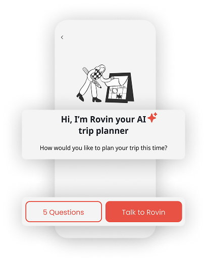
Guided onboarding, clear structure, and thoughtful personalization reduce decision fatigue while keeping the experience flexible for different travel styles.
#FDE5E3
#44DAE8
#F4F4F4
#FFFFFF
#0C0C0C
These screens define the foundation of the system and support daily operations across all roles.