The Brief
Designed for Studio Deshe
A brand built on trust, the design has to feel it.
Raya’s previous website felt clinical and distant, the opposite of what Bach flower therapy is about. For a brand centered around emotional care and sensitivity, that disconnect was doing real damage. The design wasn’t just outdated. It was working against the brand.
Rebuild trust
Clarify the offering
Drive conversions
Rebuild trust
Clarify the offering
Drive conversions
Before & After
Same brand. Completely different feeling.
Logo evolution
Old logo
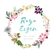
New logo

Website redesign
Before
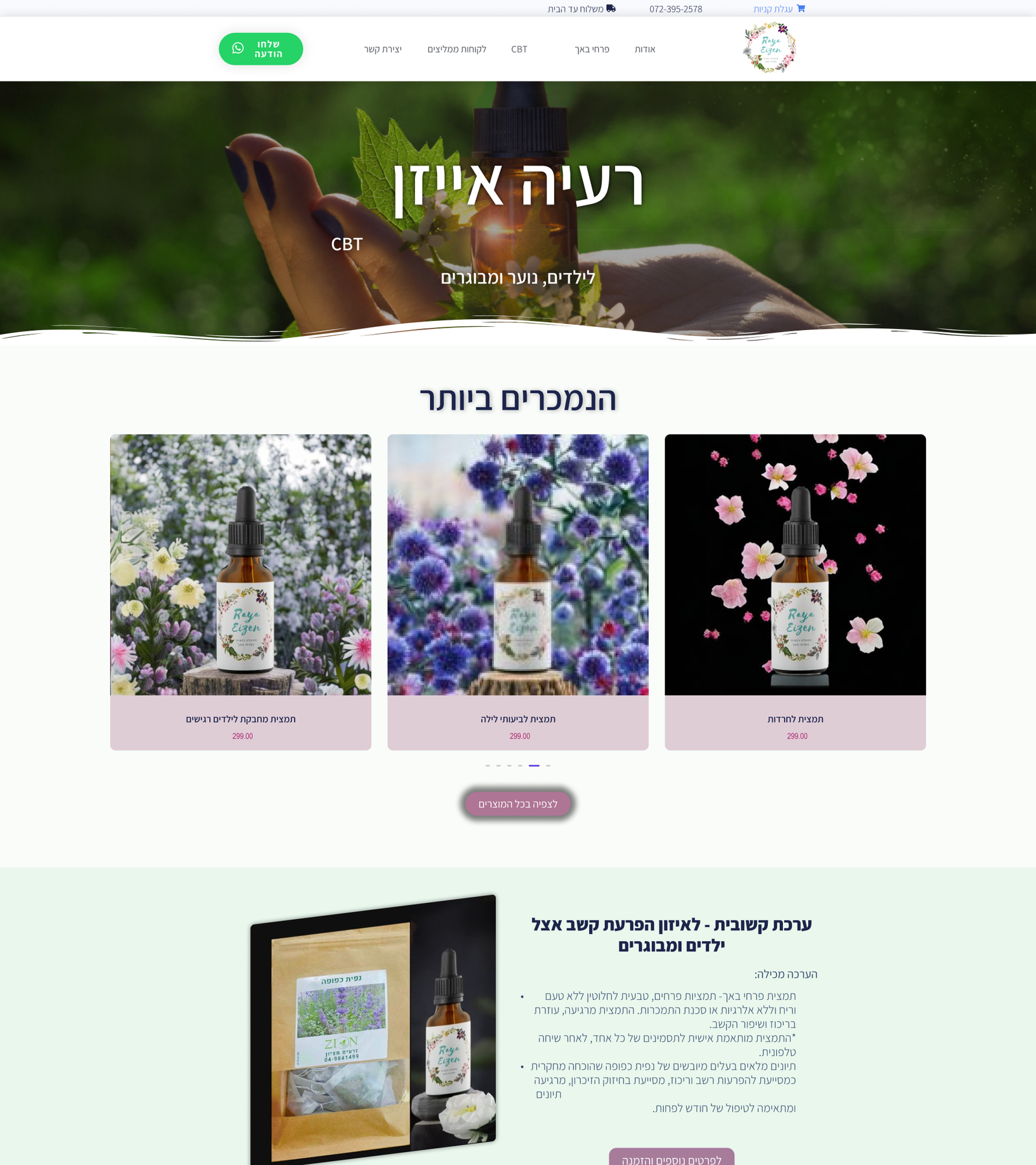
Clinical & distant
Outdated layout, cold palette, no clear connection to the brand’s emotional core.
Before felt
- Clinical
- Distant
- Outdated
- Hard to trust
After
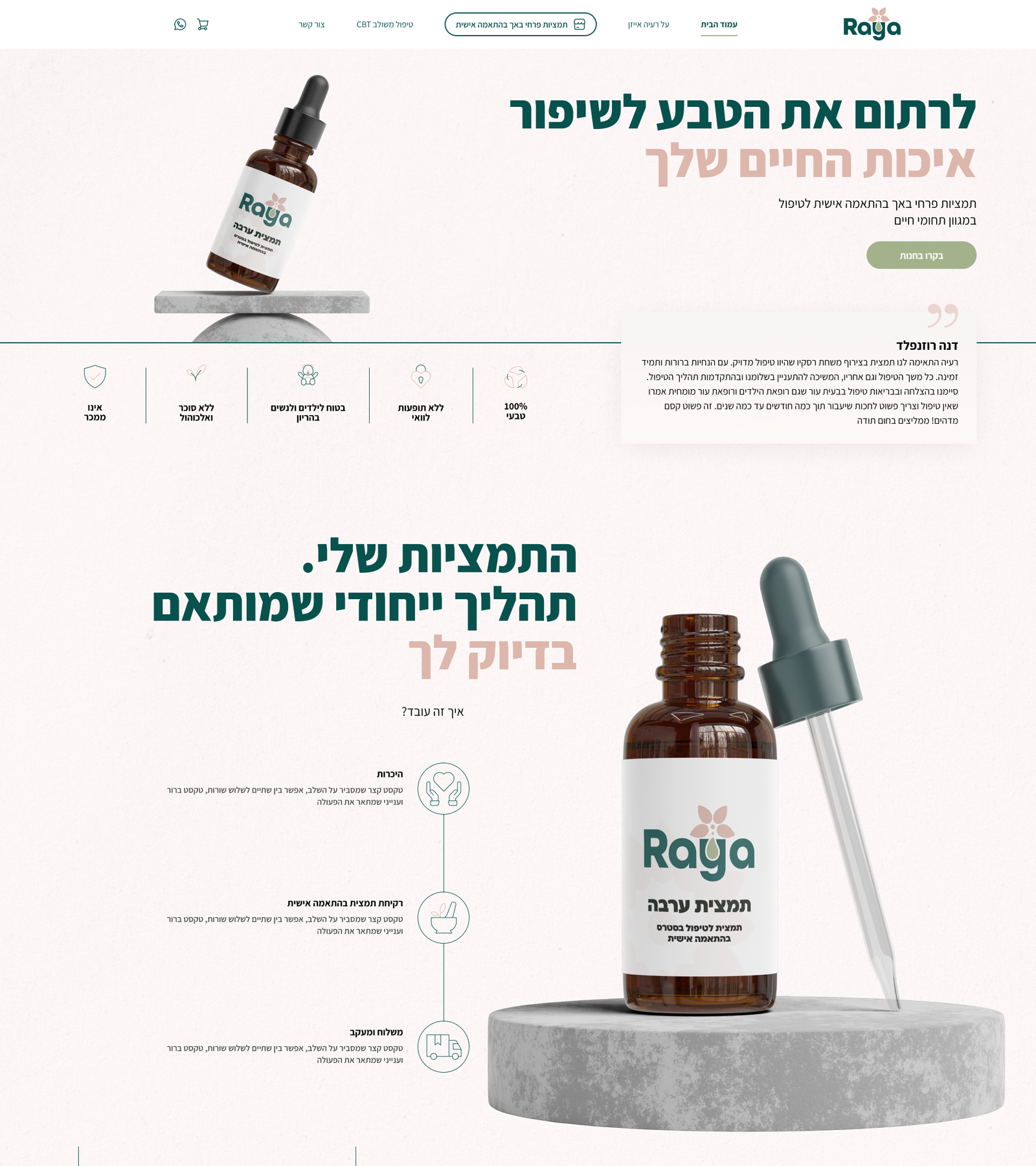
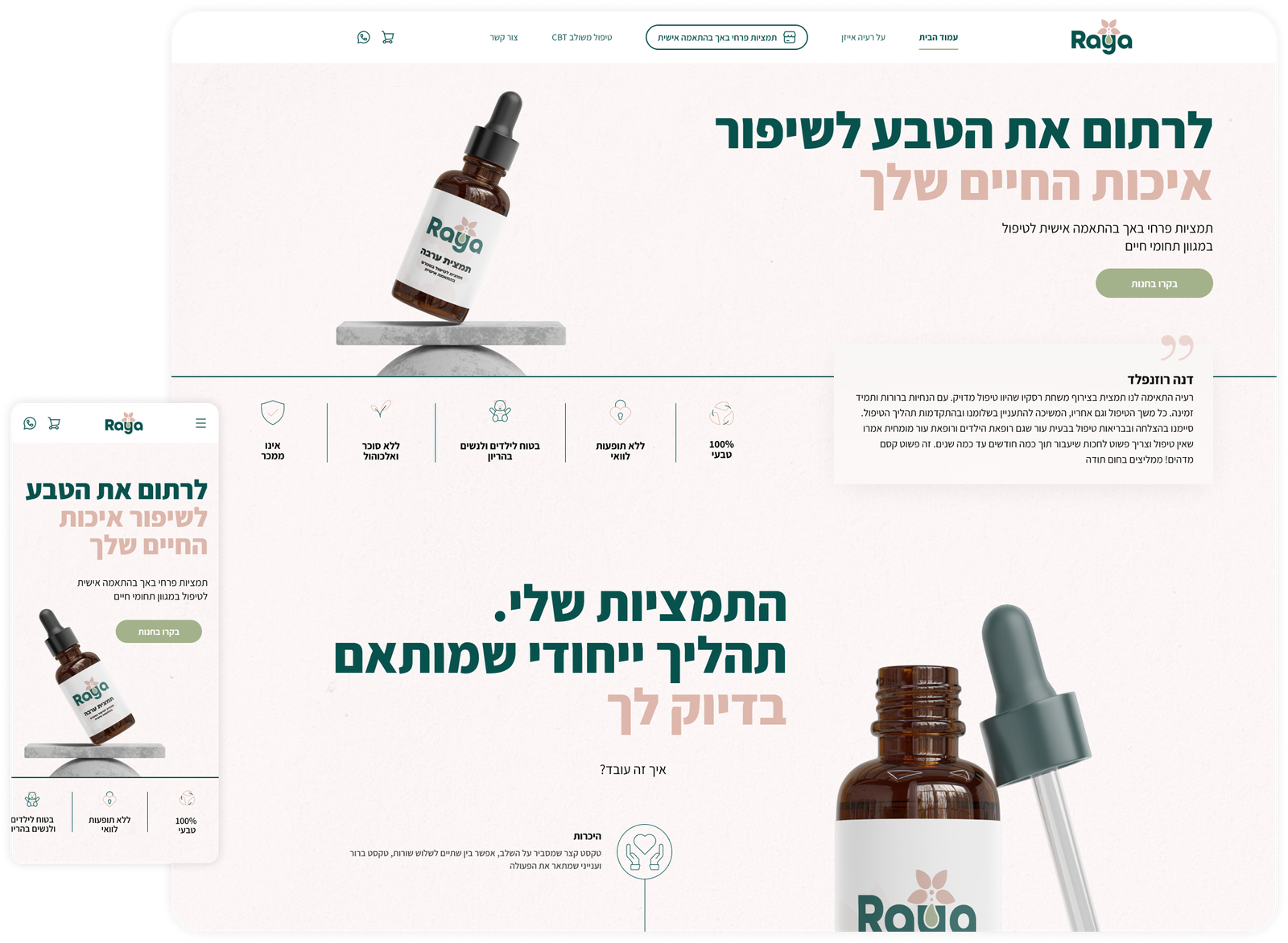
Warm & trustworthy
Soft palette, clear structure, designed to build trust before the first purchase.
After feels
- Warm
- Professional
- Human
- Trustworthy
Audience & Values
Designed for people who invest in their wellbeing.
Raya’s audience isn’t just buying a product, they’re investing in their emotional wellbeing. The design had to speak to that intention from the first scroll.
The Wellness Seeker
Adults 28–55 exploring natural and holistic approaches to emotional health. Values authenticity and clarity over clinical language.
The CBT Patient
Someone already in therapy, looking for complementary support. Needs to feel safe and understood, not sold to.
The Thoughtful Gifter
Buying for someone they care about. Needs the site to feel trustworthy enough to recommend. Driven by emotional intent.
Brand values
Warmth over polish
Trust through clarity
Care meets commerce
Sensitivity in every detail
Warmth over polish
Trust through clarity
Care meets commerce
Sensitivity in every detail
The Solution
Every detail tells the same story.
The visual system was built to carry Raya’s emotional identity consistently, from logo to color to type. Nothing feels accidental.
Color palette
#08524E
#DDB7AC
#A4B28B
#000000
#FFFFFF
Typography
Primary: Assistant
Assistant brings softness to the interface. Its rounded shapes and natural rhythm make the reading experience feel calm and approachable.
Decisions that shaped the system.
Tablet first
First screen = most important action
Menu depth by role
Final Screens
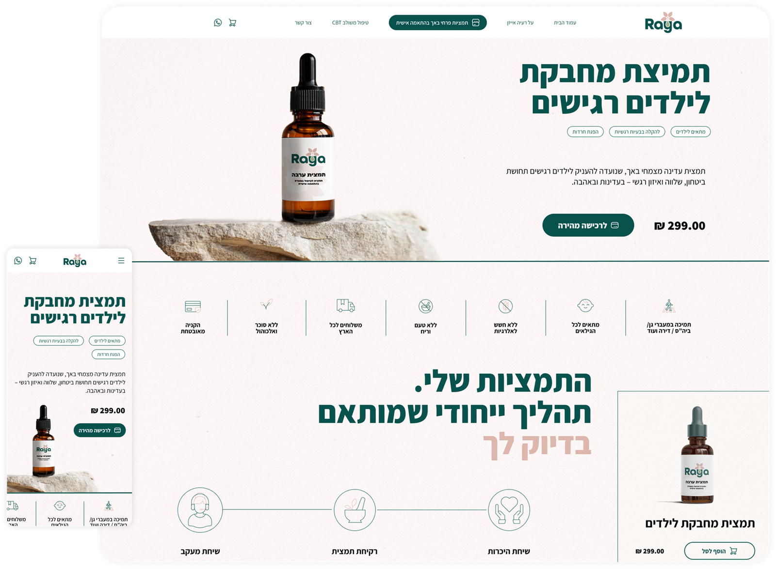
The finished store.
Home page
Store page
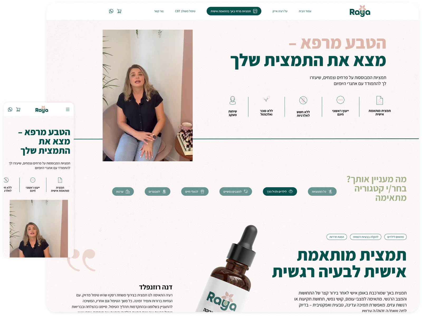
Product page